Crafting your brand and business for mobile is as important as it is unavoidable. On average, Americans spend two and a half hours on their phones a day, which has digital advertising and content production hot on the minds of industry professionals. Both are crucial elements of mobile branding, but a mobile-friendly website should not go overlooked, especially when 60 percent of consumers say they will abandon a website that takes longer than three seconds to load. Further, 30 percent say they will abandon a purchase if the shopping cart isn’t optimized for mobile devices.
To avoid losing this valuable business, apply these strategies to optimize your website for mobile:
Draw Attention to Local Business Options
Users frequently search for a product or service to meet an immediate need. Highlight your unique services to stand out amongst competitors.
Tailor Your Site to a Small Screen
- Make Call to Action buttons front and center (buttons like Buy Now! or Call Now! that immediately send the user to the appropriate screen).
- If your Call to Action is a phone call, keep promotions and other directions out of the way to avoid distracting the user to an action that is less important.
- If your Call to Action is a form, simplify entry by limiting data fields, and turn off autocorrect for fields like First and Last name.
- Make fonts easy-to-read. Hootsuite recommends:
- 14 point font for content.
- Minimum 12 point font for forms.
- 44 point font for buttons.
- Use high resolution images. iOS screens are high definition, and require double the image resolution to that of a desktop screen.
Create Cross-Device Consistency
- Always include full website or desktop options, as some users may want to access your full site for an enhanced experience.
- If a user has to move to another device to access your site, be sure they can pick up where they left off. Cross-browser IDs suggest pages the user has frequently interacted with, and shopper profiles retain cart items across devices.
- Use mobile-first responsive design, which provides the best possible experience at the mobile level, but improves design and functionality as screen size increases. Refer to the infographic below.
- Test your site frequently and on multiple devices, don’t limit device testing to just one model or brand.
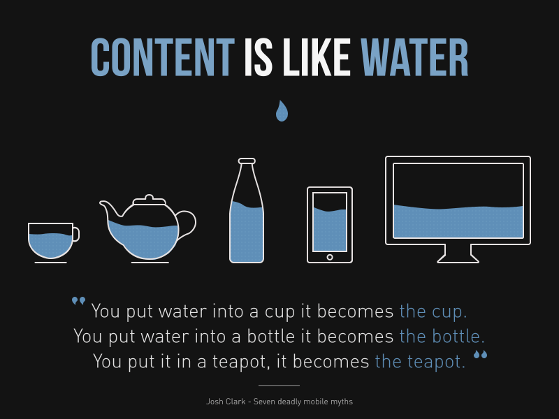
Mobile-First Responsive Design